Tuesday, December 14, 2010

Final Thought

As this marks the last five posters of my project, I must say that ending here has been quite a road trip from where I began.  With much thought and research, and with every single odd against me I have finally arrived to this.  Getting familiar with photoshop was a nightmare!  I must do something about this over break seeing that next semester we will be getting into it even more.  Also,  I had to learn Google Sketch Up and since these computers have crashed so many times, I'm very discouredged to try it in school now.  However it is a handy tool and I plan on using it for a private project on my own this break to get me to become enthusiastic again.  So here is my work.


Poster #1


Poster #2

Poster #3


Poster #4

Poster #5
  

Tuesday, November 16, 2010

Process

As I first read the program I started to literally draw a circle for every room and the common adjacenties .


Relationship Diagram #1


Relationship Diagram #2
 
Then the next step of the process, I decided not to have a heirarchy in my office plan. I started to make bubble diagrams of office layouts according to the program and how I perceived it in my mind.
Bubble diagram of Main Level

Below is the Mezzanine, and I originally thought it out as one solid block overlooking everyone else.


Mezzanine
 Here is the bottom level.  As you can see, it is a very loose sketch.
 

Wellnes Space
 The next phase of the process was doing block diagrams.  I like calculating the square footage of a space because there are different ways you can do it to bring more versatility to the space planning.  I wanted the reception directly in front.  To me, that is a great first impression.  Also, in this phase, I trimmed and cut all of my block diagrams individually on trace to give me the flexibility I needed.  To me, that is the most effective way for me to understand. Below is what I pieced together, literally, from my trace blocks.


First Floor Block Diagram
  With the help of Jesse, the mezzanine was more of a challenge.  With respect to my location, the mezzanine was to have holes to create an island affect from one office to another.  Circulation was generally around the holes to look down.  The path of travel would be wood inlay to give that "boardwalk" affect.

The Wellness space block diagram was designed on CAD.  It is located in template 1. Here are a few photos of inspiration.


Process Presentation


Thursday, October 21, 2010

Wellness and the Office Workers

The workplace itself has a powerful affect on people’s health. When people are satisfied with their job, they are more productive and tend to be healthier. When employees feel that the environment at work is negative, they feel stressed.  Daylight has a large impact on employee mental and physical health, and in turn, on productivity.  One of the common ways where you can allow more natural light is through windows. In the office, allowing natural daylight in the rooms is important. However to maintain glare control, blinds will be incorporated. For the office, the largest work teams will be next to the windows to allow them to work in a highly lit space.  This is important to leave that connection with nature and improve the mental health of the workers with plenty of sunshine.


Research that I have found from Workplace Intelligence Unit has been quite helpful in conducting reasearch on daylight. They found that "the single most detrimental factor was a poor office environment. For these companies, improving the office design, includes ensuring high levels of daylight, proved to be the most effective solution" (Daylight in the Office, A Matter of Balance).


Thursday, October 14, 2010

Herman Miller Response

Herman Miller is credited with the invention of the office cubicle originally known as the "Action Office" which was stated today from a Herman Miller sales representative. Herman Miller is a leading manufacturer of office furniture and equipment. (hermanmiller.com),  They research, design, and create furniture systems that are efficient and functional.  They take the process of cradle-to-cradle very seriously to make the world better.(hermanmiller.com) Cradle-to-cradle, which is a term we have learned in our Building Systems and Codes class, is essentially taking a product from its origination and recycling it back to a new identical product.  What this company really focuses in on is the idea of creating a big effect in an office space while having a small impact on our planet. Herman Miller is meticulous about the importance of this process and all products are designed to reflect this view.

 For example, ‘the Sayl Chair is 93% recyclable’ (www.hermanmiller.com/Products/SAYL-Chairs).  This is one of their newest products as well. That says a lot.  They really prove what they talk about.  “The design inspiration came from Yves Béhar and his fascination for the Golden Gate Bridge in San Francisco. As affordable as it is inventive, SAYL disproves the notion that a reasonably priced chair means offhand design and minimal ergonomics” (www.hermanmiller.com/Products/SAYL-Chairs).  This in turn, is another reason why this company deserves recognition.  They take what they do very seriously. Below is the masterpiece.


Here is a detailed description of why it was made. “The suspension material is stretched from the Y-Tower at the back of the chair just as cables are stretched from the towers of a suspension bridge. The name reflects the sailing vessels that pass beneath the bridges that inspired the original design. Replacing the "i" in "sail" with a "y" is a nod to the innovative Y-tower structure of the work chair, (www.hermanmiller.com/Products/SAYL-Chairs)”.

Moving into another interesting contribution to their reputation is a certain office system that is quite amazing actually. This system is known as the Resolve system.  It was designed by Ayse Birsel and its key component is that it is a human-centered system.  What does that means?  In a nutshell, “it is based on the size, reach, and movements of people. Resolve creates friendly work spaces; its shapes and openness encourage people to connect, interact, and collaborate. Air and light pass through; people can see in and out and don't feel confined. Acoustical inserts absorb and block sound, and Qt Quiet technology reduces noise distractions” (hermanmiller.com/Products/Resolve-System).  You couldn’t get a better system than that.  It solves a lot of common office problems. Below are some pictures that I found.


Another interesting point is that it is known for having a natural approach in its design. By this, I found that it mimics the natural world, starting with the 120-degree angle, the most common angle in nature (www.hermanmiller.com/Products/Resolve-System).  Who finds this stuff out? Herman Miller does and this puts them on the map.


Another aspect of this company is the extensive research on ergonomics solutions to the office space.  This is where the Embody chair takes the scene. Below is a picture.


This chair was ‘specifically designed for people who work for hours at computers’, period (www.hermanmiller.com/Products/Embody-Chairs). So basically, the typical clients for this chair are computer engineers and techs, software designers, and even clients such as Landor. “The back of the chair looks like a spine which is entirely intentional. Embody's instinctive back adapts to your movement, adjusting automatically to your shifting positions, keeping your spine aligned and healthy. Whether you lean forward or recline, your lower back support remains constant—no adjustments needed” (www.hermanmiller.com/Products/Embody-Chairs).

Balance in Jakarta's Busy Lifestye

It is becoming a common practice to head towards a reflexology center in Jakarta, Indonesia to find peace in a stress filled city.


Used specifically to relax the body, certain pressure points in the feet are messaged that have direct correlation to internal organs; thus this is an overall health practice.

A 2008 article from the Jakarta Post mentions, “Reflexology centers are easily found in Jakarta's shopping malls, many of the upscale serviced apartments, and even in some office towers which double as residential suites.”  The article also confirms that there is a high demand for reflexology centers in Jakarta all together. A brief explanation of a typical session is as follows: “a reflexologist applying pressure with thumbs and fingers at various points on the feet, known as reflex zones” Jakarta Post, 2008 (www.thejakartapost.com/news/2008/12/24/reflexology-getting-it-right.html)

The two pictures above are from an article named Wine and Dine Indonesia, 2010, and they were taken from the LifeSpa and Fitness Centers and Zen Living in Jakarta, Indonesia. This is a typical example of what their centers look like. (www.expat.or.id/info/reflexology.html )

Thursday, October 7, 2010

Site Analysis: Jakarta, Indonesia

I am in charge of designing an office space layout for the internationally recognized graphic design firm known as Landor. They have many international locations and my site is Jarkarta, Indonesia. Here is a good map of exactly what makes up Indonesia.

INDONESIA
Image from: http://www.taiwandna.com/JavaIndonesia_provincesMap.png

All of the areas in pink are the different regions\provinces that make up Indonesia. It is now the world's third-largest democracy, the "world's largest archipelagic state (meaning a state comprised of islands), and home to the world's largest Muslim population. There are 17,508 islands to be exact but only 6,000 are inhabited.  It is on the equator, and it is sandwhiched between the Indian Ocean and the Pacific Ocean. Because of its location they are more prone to occasional floods, severe droughts, tsunamis, earthquakes, volcanoes and forest fires. The climate there is tropical which means it is very hot and humid. Bahasa is the official language but there is also English, Dutch and local dialects; the most widely spoken of which is Javanese."(Wikipedia, Indonesia).

Borobudur Temple, Java, Indonesia

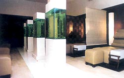
Art Center, Bali, Indonesia

JAKARTA
Jakarta is the capital and largest city of Indonesia and it is the location where I will be analyzing. It is located on the northwest coast of Java. A 2010 census showes a count population of 9,580,000. It is the twelfth-largest city in the world. The metropolitan area is known as Jabodetabek. The city's name is derived from the old Javanese word "Jayakarta" which translates as "victorious deed", "complete act", or "complete victory". (Wikipedia, Jakarta).


Jakarta is at the mouth of the Ciliwung River on Jakarta Bay, which is an inlet of the Java Sea. It is divided into five kota or "cities" each headed by a mayor. On the map below, number 1 is Central Jakarta, 2 is West, 3 is South, 4 is East and 5 is North Jakarta. (Wikipedia, Jakarta).


 ART
Jakarta has several performing art centers and traditional Indonesian art performances at the pavilions of some provinces. It hosts several prestigious art and culture festivals as well as exhibitions such as film and jazz. Taman Mini Indonesia Indah a.k.a TMII translated as "Beautiful Indonesia Miniature Park" is a culture-based recreational area located in East Jakarta, Indonesia. This 250 acre park is a synopsis of Indonesian culture, with virtually all aspects of daily life in Indonesia's 33 provinces encapsulated in separate pavilions with the collections of architecture, clothing, dances and traditions.  It has 7 religious buildings, 14 museums, 18 monuments, halls and exhibits, 10 recreational facilites and much more. (Wikipedia, Taman Mini Indonisia Indu).

Taman Mini Indonesia Indah
 
 
'Pacu Jalur' , a traditional riau dance

Istana Anak-anak Indonesia


Castle of Indonesian Children 


CUISINE
There are 20,000 Padang restaurant establishments in Jakarta alone. Padang restaurants specialize in Minangkabau cuisine which is derived from the West Sumatra region in Indonesia. Because most of Minangkabau people are muslims, Minangkabau cuisine follows halal dietary law rigorously. Protein intakeare mostly taken from beef, water buffalo, goat, and lamb meat, and also includes poultry and fishes. During a dine-in hidang (serve) style Padang restaurant, after the customer being seated, the customer does not have to order first. The waiter immediately serves the dishes directly to the table, and the table will quickly be set with dozens of small dishes filled with highly-flavored foods. Customers take and pay for only what they want from this array of dishes. There are more foodstalls than restaurants in Jakarta, however.(Wikipedia, Padang food).


TRANSPORTATION
Jakarta is strained by transportation problems. "The city still suffers a lack of urban public transport services due to the long development of road networks that accommodate mostly private vehicles. In Indonesia most communal transport is provided by mikrolets, which are privately run minibuses, although these normally avoid main thoroughfares. A 'three in one' rule during peak hour was introduced in 1992, prohibiting fewer than three passengers per car on certain roads." (Wikipedia, Jakarta).

Traffic cirlce, downtown Jakarta


Gambir station
 
The neighboring cities of Jakarta such as Depok and Bogor to the south, Tangerang and Serpong to the west, and Bekasi, Karawang, and Cikampek to the east, is served by KRL Jabotabek, a mass rapid transit system serves commuters in and around Jakarta. The major rail stations are Gambir, Jakarta Kota, Jatinegara, Pasar Senen, Manggarai, and Tanah Abang. During peak hours, the number of passengers greatly exceeds the system's capacity, and crowding is common.(Wikipedia, Jakarta).

PARKS
 Merdeka Square is a large square located in the center of Jakarta, Indonesia.The square is surrounded by important government buildings such as the Merdeka Palace, the Supreme Court and various governmental ministries. At its center stands the National Monument. Below is a picture. (Wikipedia, Jakarta.)


THE SITE

Here is a satellite picture from this link: Landor official site.  It appears to be located near the national monument.  Because of it's central location there is sufficient transportation in that general area.  Overall is mostly flat.

Tuesday, October 5, 2010

OlioBoard


Here is my OlioBoard which I put together based off of my work of art that I'm analyzing.  I put subtle uses of red in there.  It's mostly a blue a grey violet palette and I added strong hues of blue as the accent.

Schematic Design Process


The painting I chose was from Tom McNease and it's called New Image.  This painting keeps the viewer's attention.  It's very interesting.  The feeling of calm and relaxation is sensed.  Some may think of water or a wave, ice or frost when they look at it.  McNease uses paint that is not specified.  He specializes on transferring paint from glass to board which is in this case.  When using glass as the medium, it causes unique arrangements with the paint.  It's not certain that it's intentional or not.

The lines are thin and smooth.  They are slightly curvilinear and used to break up the patterns that the paint makes being being on the glass.  The patterns are mostly organic shapes that can either look like coral, or the composition of a snowflake or frost.

The color is expressive, mostly vibrant with very small muted shades of grey and violet.  The dominant color is blue and it's a cool color, however there are some elements of red in the painting throughout.  This helps it not be so cool and towards the bottom, the mixture of blue and red are making a soft violet color appear.  It's the dark blue areas that give it depth.

There is no appearance of a light source in this abstract piece; however there is a good amount of white that is interplayed in the composition.  This brightens and breaks up the heavy blue blotches of paint and gives the work some room to breathe since there is so much blue.

There is a sense of depth in this piece.  Some of the white thin lines bring the viewer into a vortex that is focused to the left middle of the painting.  This creates some depth to the work of art.  There is an important observation that sticks very obvious in this work.  Ther is a perfect circle in the vortex.  This can be referred to as a close-up zoomed in detail inside of a bubble.  This conveys definite precision in a geometric element, to a work that is very abstract and random.  This is what draws the viewer to see this open window detail.

There is definitely movement to the painting.  The eye is drawn upward and around clock wise.  With regards to the name of the composition, "New Image", it looks like the birth of anew idea and that it possibly is contained in the bubble circle.

This work certainly depicts contemporary art and the Louisiana artist himself.  His work is environmentally derived and uses a unique paint transfer process of which he keeps private.  He also focuses on expressionistic imagery and this piece reflects that.


These sketches are what I pulled apart through the painting.  I see two elements that stand out strongly.  The first is line and the second is texture. The left sketch is both line and texture.  The middle on is mostly line and the third sketch on the right is all texture.


When I overlayed my sketches, I came up with many different abstract configurations. The first on the left,I emphasized line and I played with pattern to created a radial symmetry.  I took the element of the circle and put it in the center.  The second overlay in the middle depicts the organic shapes that I zoomed in on through the texture sketches.  I used a thinner pen to specialize the detail of the lines within the organic shape. The third focuses more on line and shape and taking two elements and seeing how they create a relationship together.  There is balance in this particular overlay between the two circular shapes.  I found a piece that would join the two and it created a fan like appeal. 

Pictures on my models will be coming soon!